

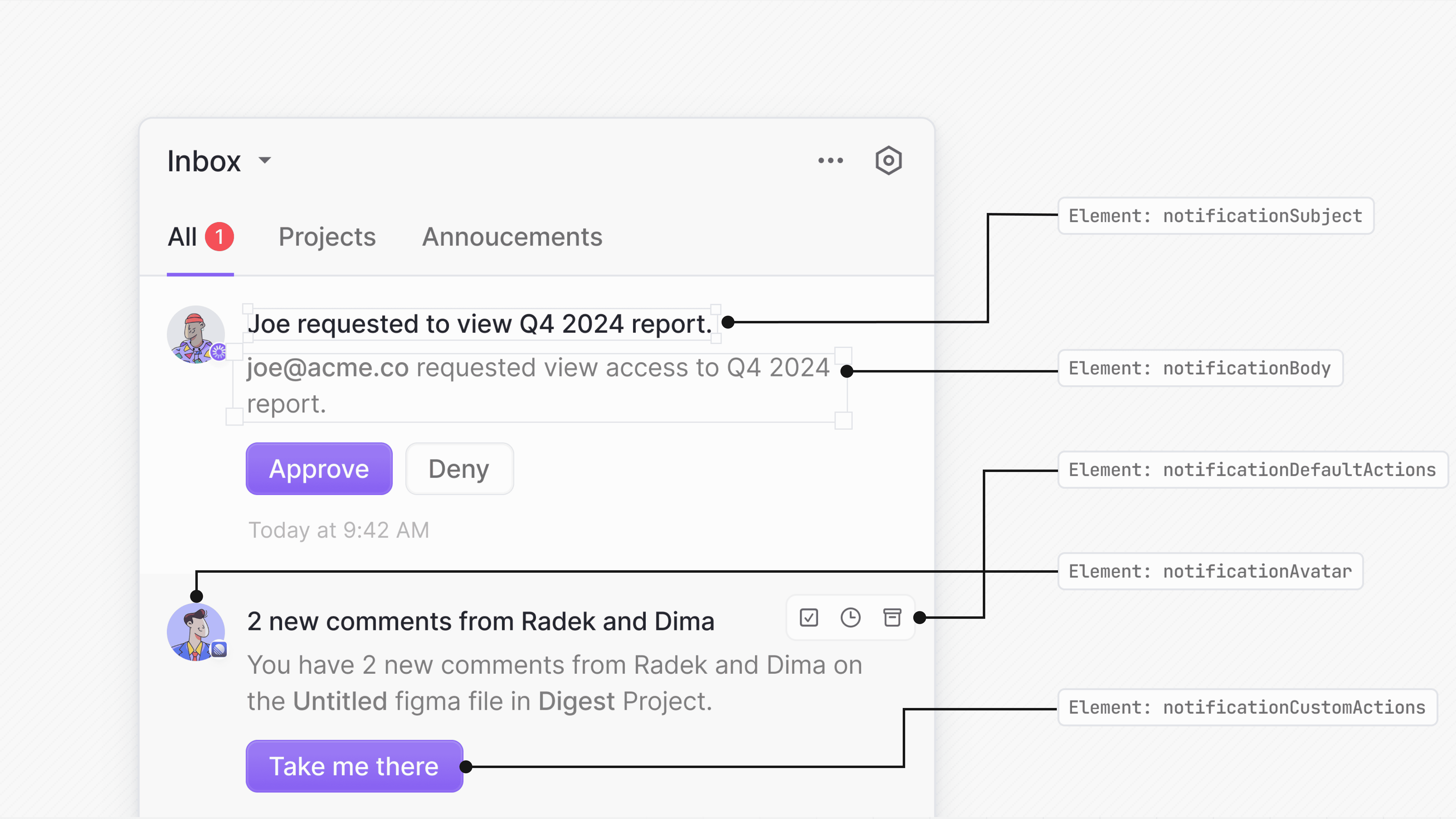
Customize notification subject
Use therenderSubject prop to provide a custom component for the notification’s subject line while keeping the rest of the notification style intact.
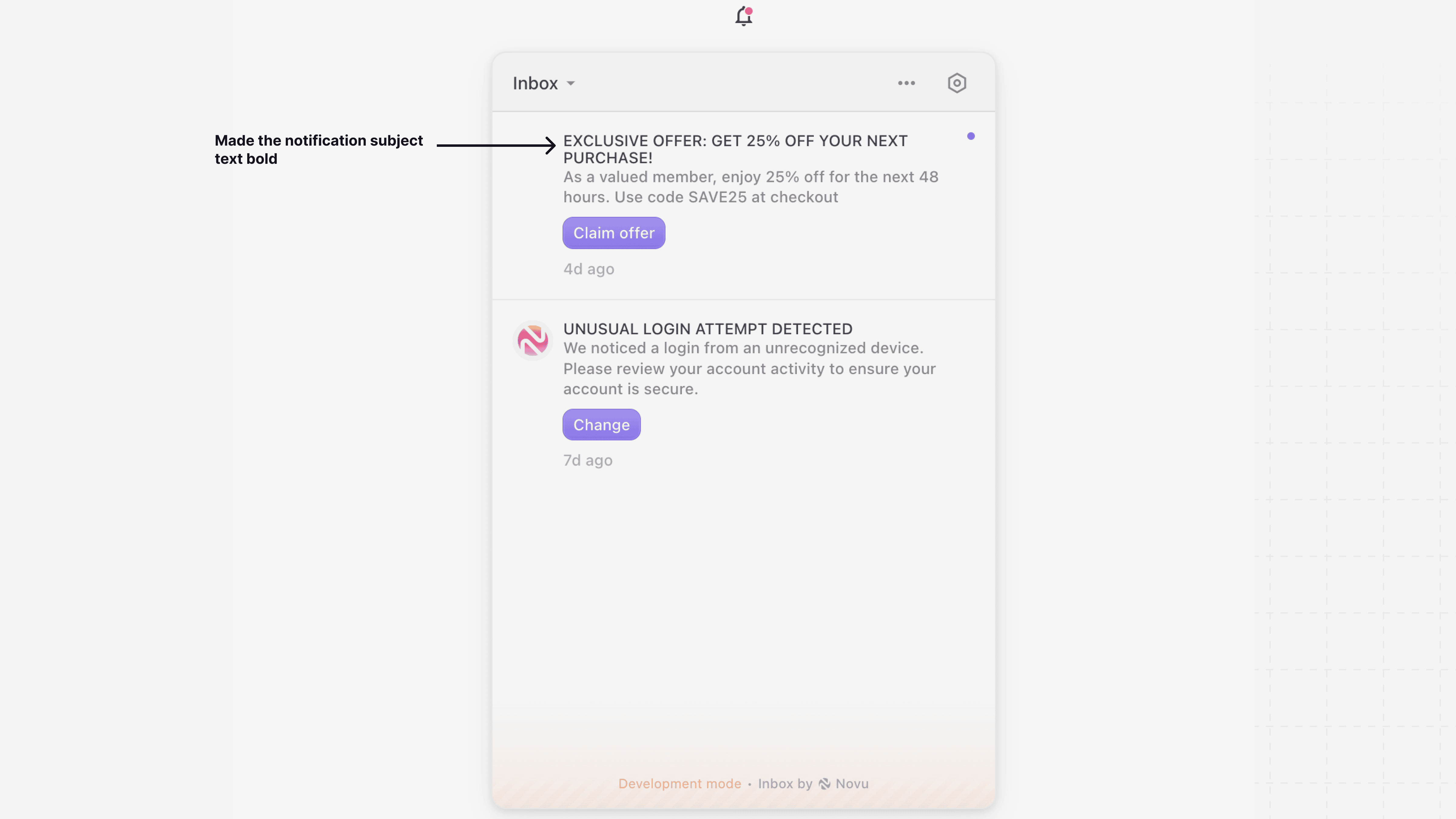
Customize notification body
UserenderBody if you want to keep the default Inbox UI and only change how the body is rendered. This is useful when you want to customize content formatting or include additional fields from the data object.
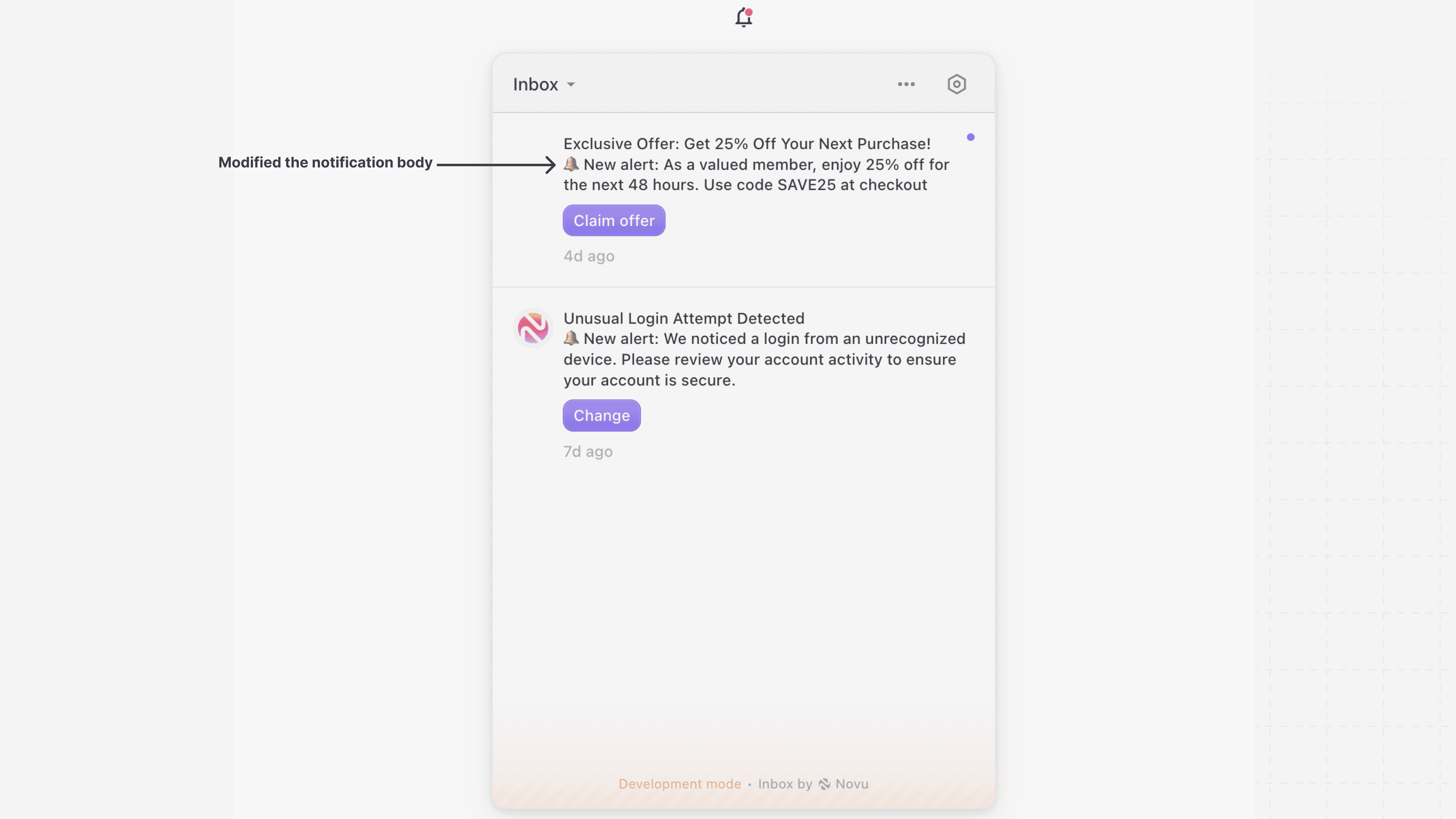
Customize notification avatar
Use therenderAvatar prop to replace the default notification avatar with your own custom component. This allows you to display user images, icons, or any other visual element that fits your application’s design.
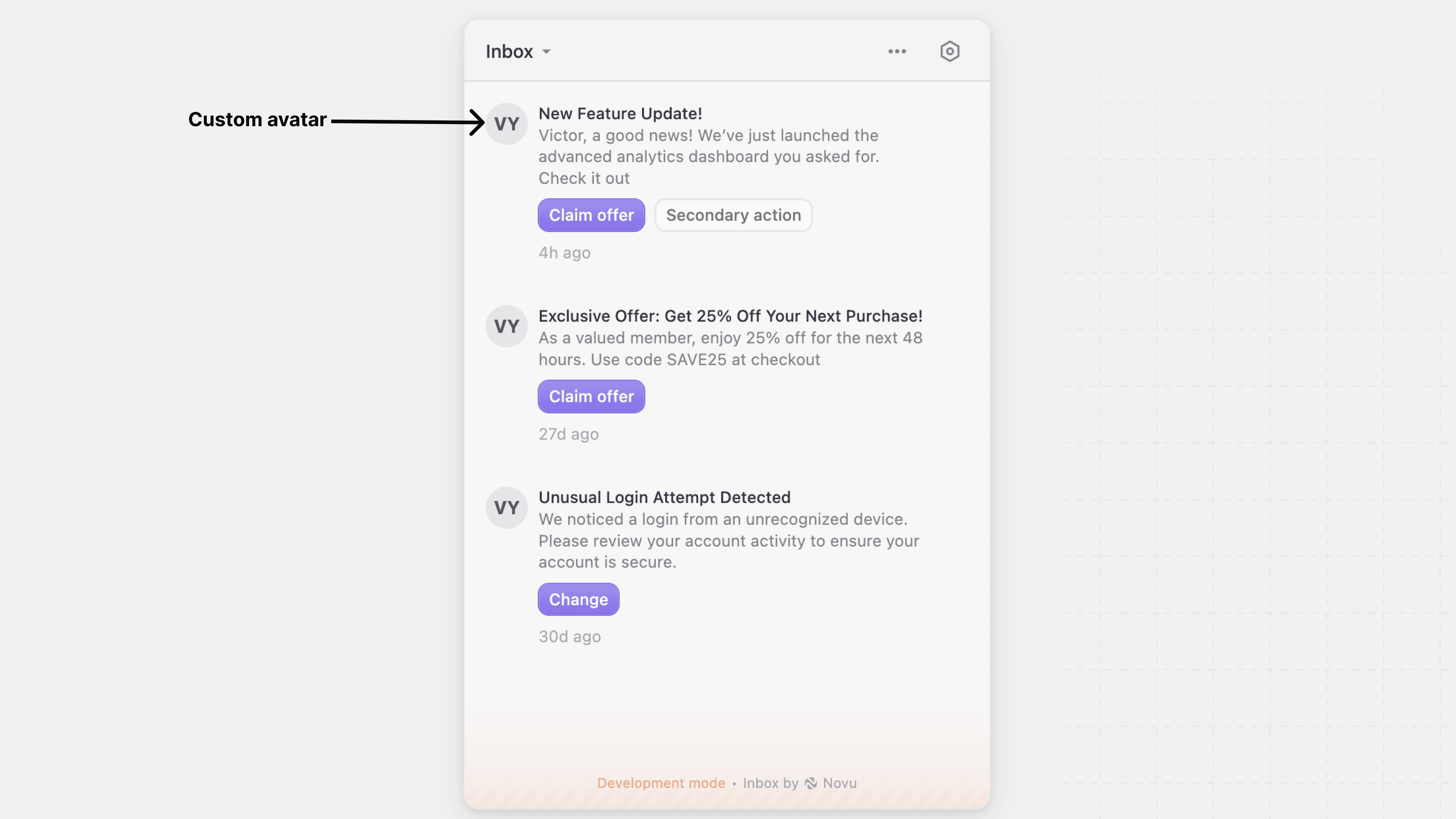
Customize notification actions
Novu provides render props to customize actions:Default actions
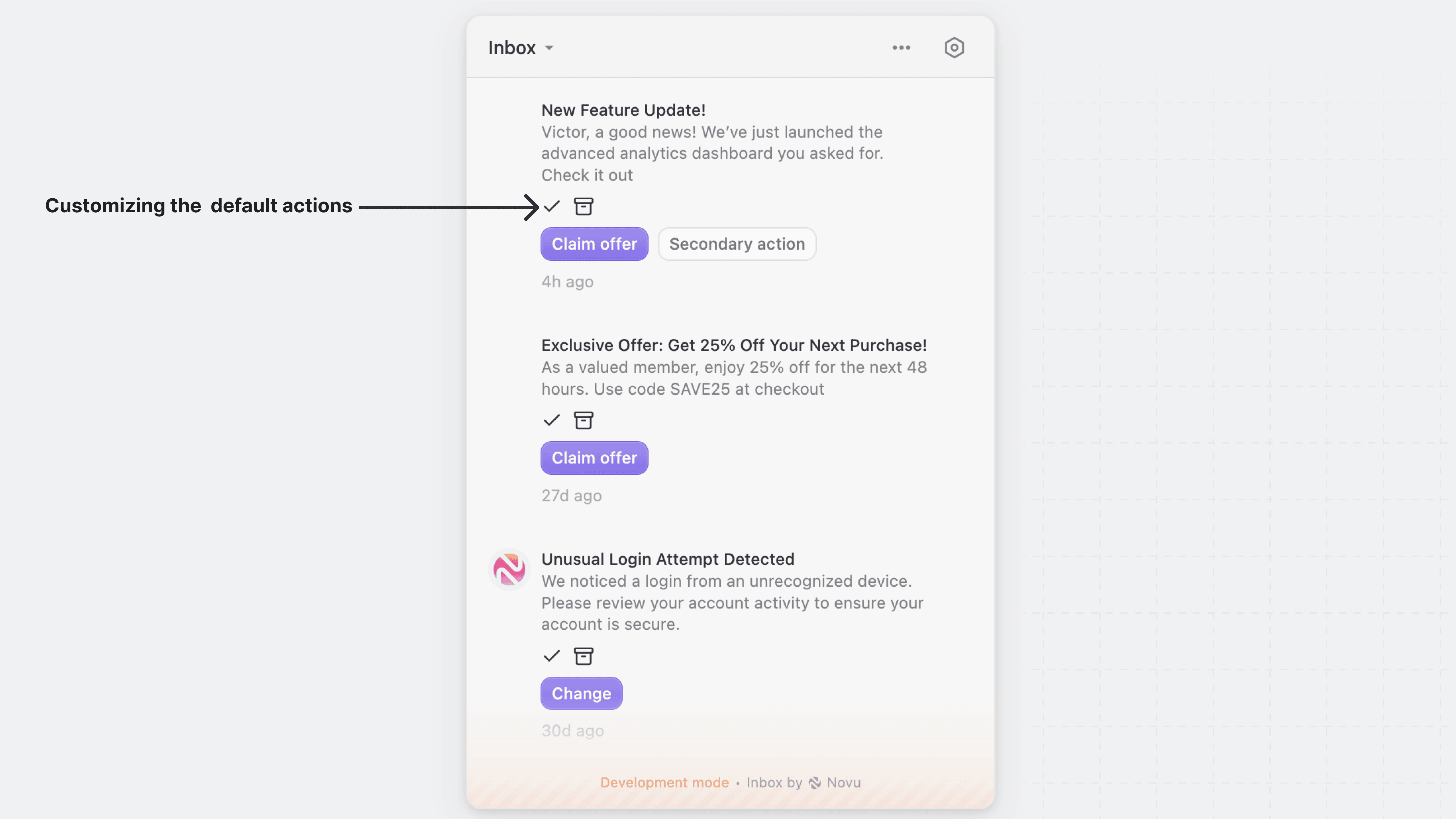
Use therenderDefaultActions prop to override the default action buttons for notifications, such as “Archive,” “Mark as Read,” and “Snooze.”
Custom actions
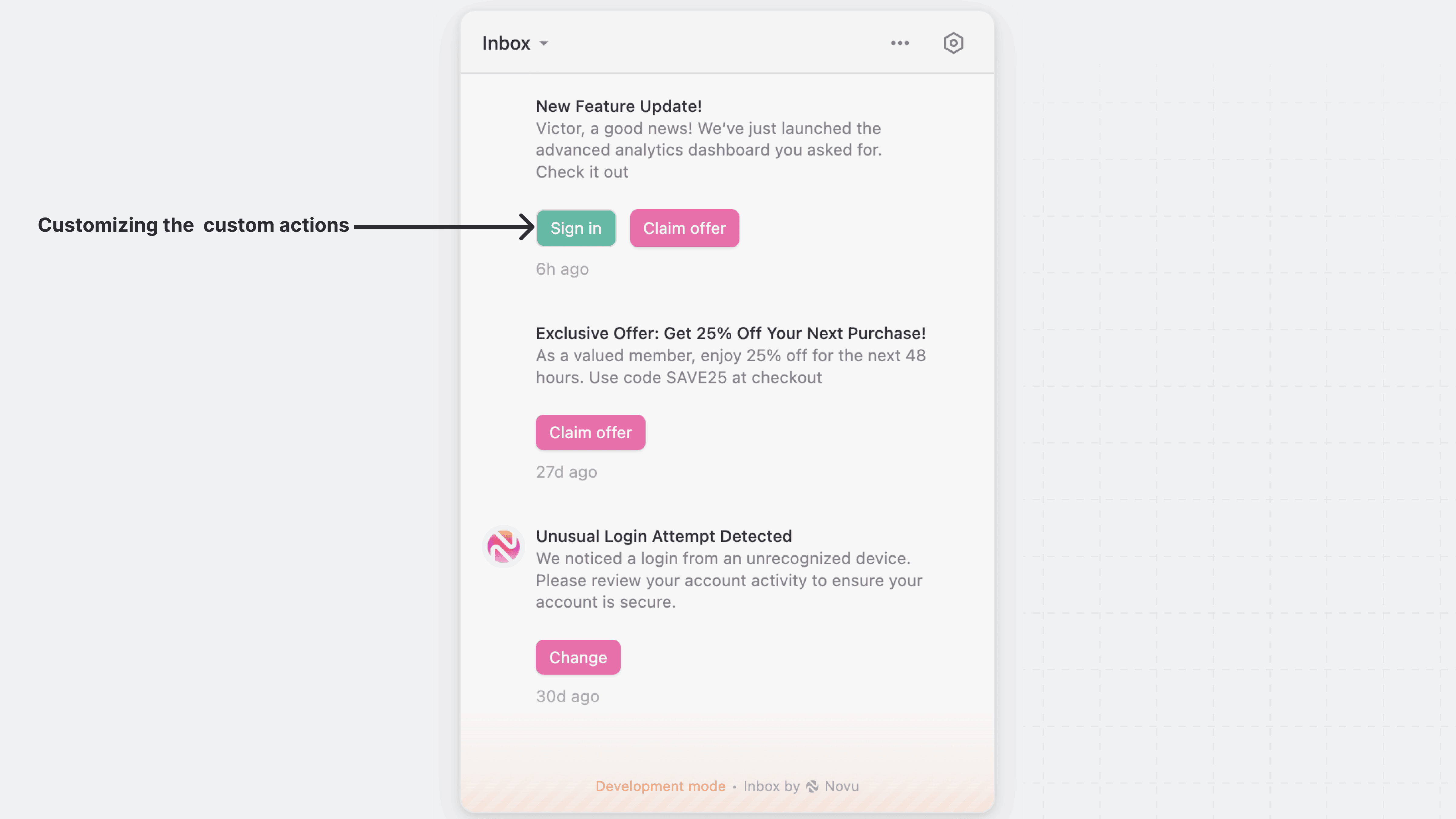
Use therenderCustomActions prop to override the primary and secondary actions buttons with your own action button. This is useful for creating unique design and interactions specific to your application.
Customize the entire notification item
Use therenderNotification prop to customize the entire notification item in the Inbox UI, including the container, layout, and the content of the subject and body of each notification.
renderNotification gives you full control over the notification UI. You do not have to rebuild the built-in behaviour from scratch: render NotificationItem inside it to keep the default look, actions and click handling, and swap or rearrange only the parts you need. See Reuse the built-in notification item.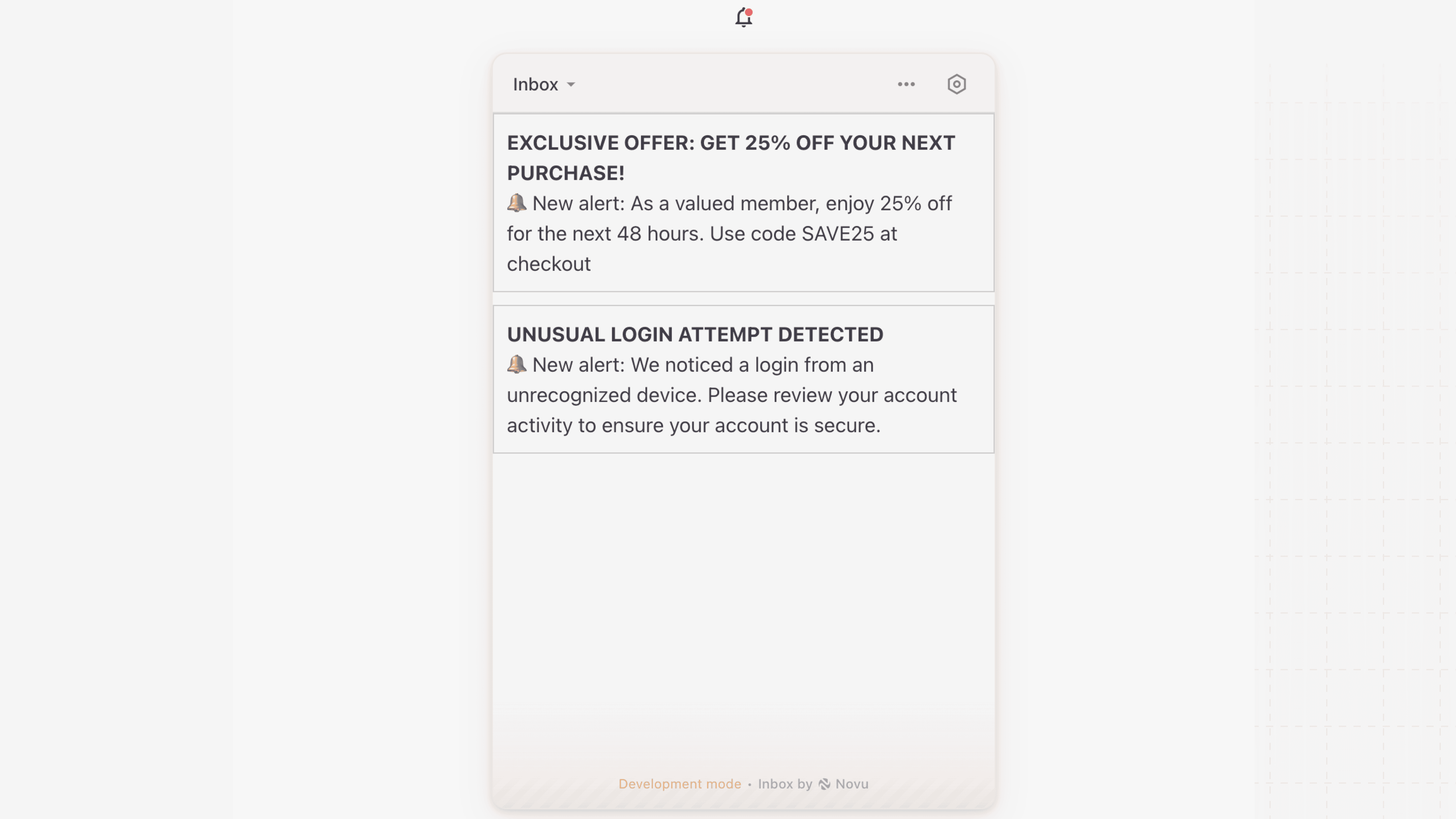
notification.read() or a websocket update, and whenever your component re-renders. React reconciles what they return, so a component you render inside a render prop keeps its state across those updates.
Reuse the built-in notification item
NotificationItem is the built-in notification item as a React component. Rendered without children it is the default look, actions included. Rendered with children it becomes a root that carries the item’s behaviour, severity styling, hover state, the click that marks the notification read and follows its redirect, around whatever arrangement of its parts you pass.
The parts are NotificationItem.Avatar, Content, Text, Subject, Body, DefaultActions, CustomActions, Date and Dot. Every part accepts a className; Subject, Body and Date also accept children to replace their content. DefaultActions and CustomActions keep the built-in read, archive, snooze and action buttons.
Keep the default look
Swap one part
The samerenderAvatar, renderSubject, renderBody, renderDefaultActions and renderCustomActions props that Inbox accepts work on NotificationItem.
Rearrange the parts
NotificationItem uses the same appearance keys as the default item, so appearance.elements styles both the same way, and it inherits the onNotificationClick, onPrimaryActionClick and onSecondaryActionClick handlers you pass to Inbox unless you give it its own.