> ## Documentation Index
> Fetch the complete documentation index at: https://novu-c5de82d9-inbox-rendering-redesign.mintlify.site/llms.txt
> Use this file to discover all available pages before exploring further.

# Customize Notification Items

> Learn how to use render props in the Inbox component to customize the subject, body, avatar, default and custom actions, or the entire notification item.

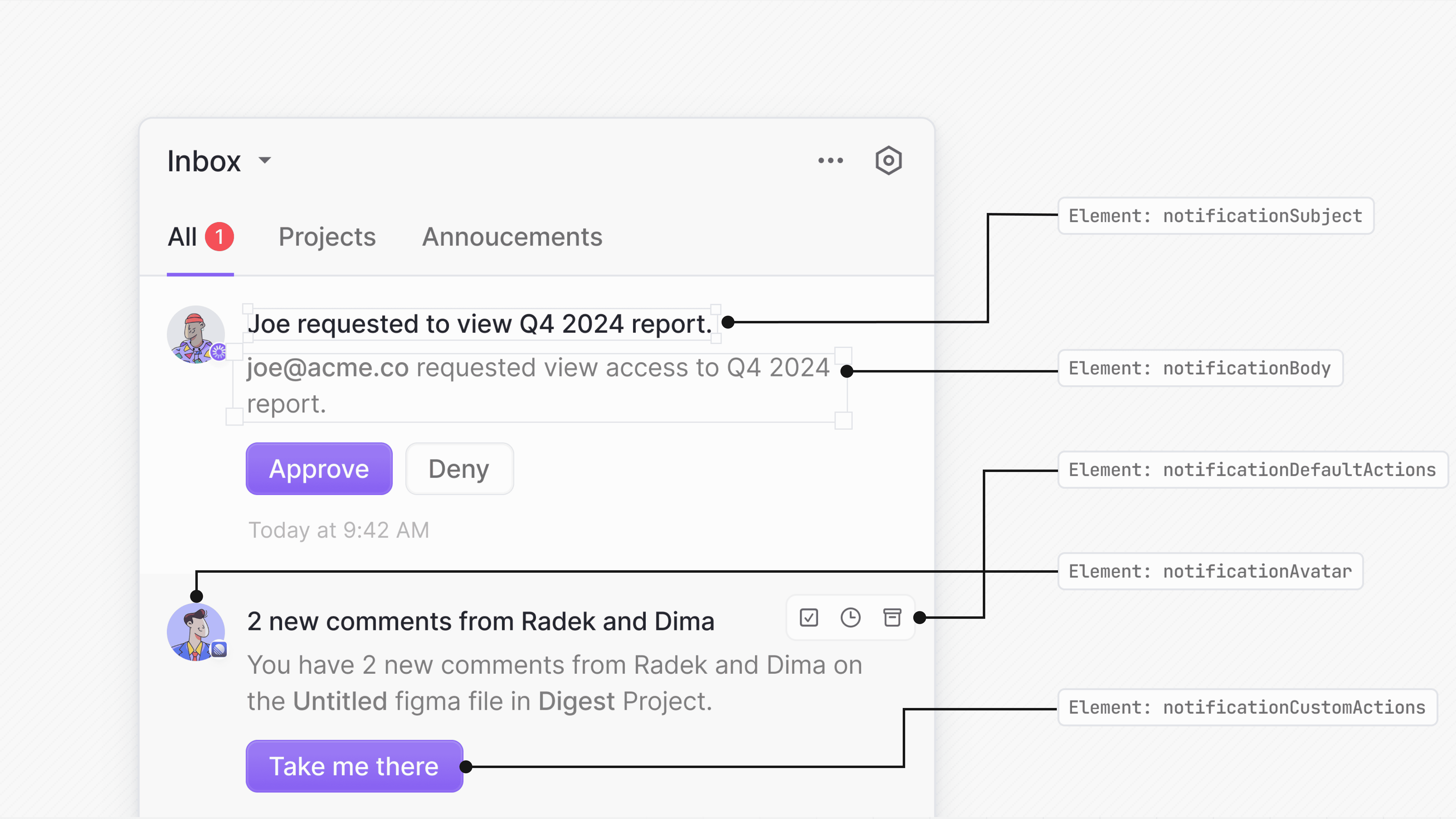
Novu exposes render props to customize parts of the default Inbox notification item - subject, body, avatar, default/custom actions, or the entire notification.

<img src="https://mintcdn.com/novu-c5de82d9-inbox-rendering-redesign/rnTO6wzeSEBhSh6h/images/inbox/notification-item.png?fit=max&auto=format&n=rnTO6wzeSEBhSh6h&q=85&s=9fe601e51daf05185219411d597e6697" alt="Notification items" width="4800" height="2700" data-path="images/inbox/notification-item.png" />

Each render prop receives the full notification object, giving you access to all the data needed to build a fully custom UI.

## Customize notification subject

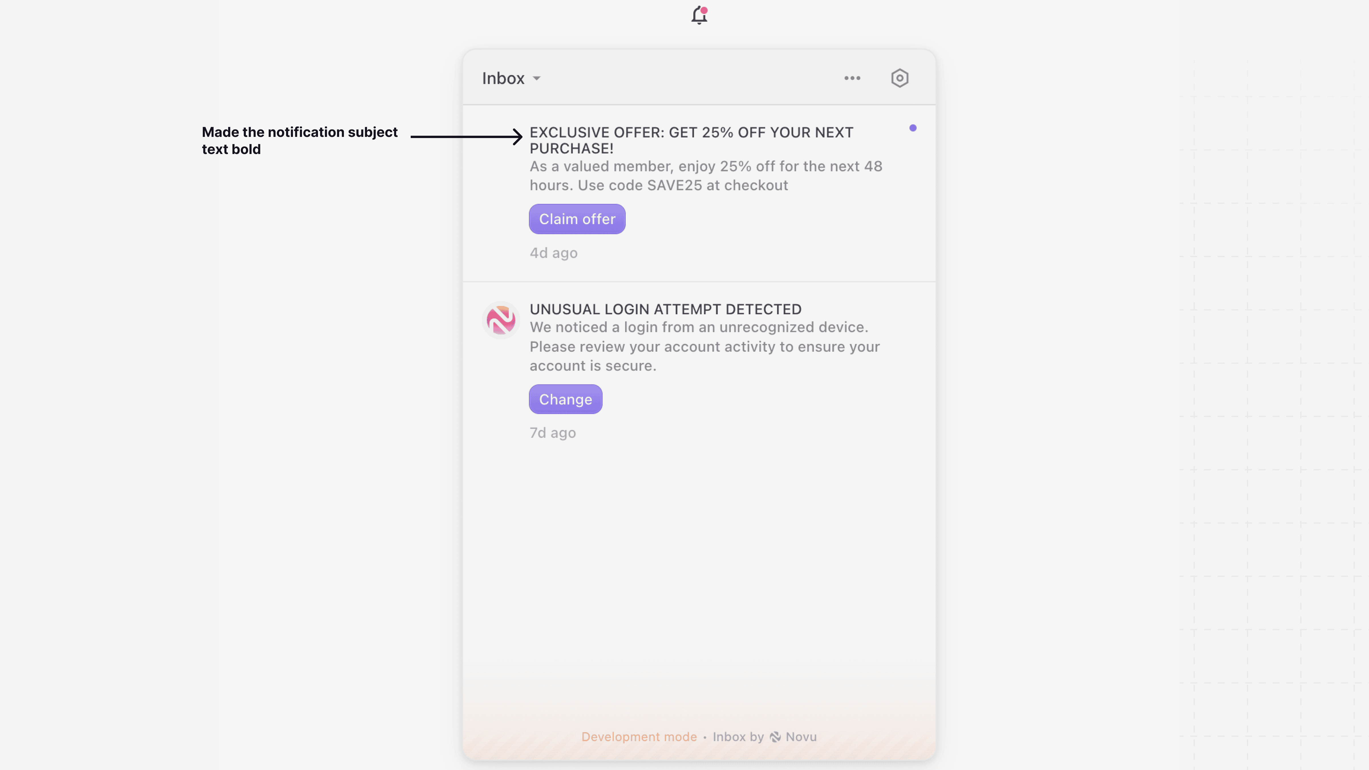
Use the `renderSubject` prop to provide a custom component for the notification's subject line while keeping the rest of the notification style intact.
<img src="https://mintcdn.com/novu-c5de82d9-inbox-rendering-redesign/rnTO6wzeSEBhSh6h/images/inbox/custom-notification-subject.png?fit=max&auto=format&n=rnTO6wzeSEBhSh6h&q=85&s=b2058290320f2a15bf8b15932801483e" alt="Customize notification subject" width="4800" height="2700" data-path="images/inbox/custom-notification-subject.png" />

```tsx theme={null}
import { Inbox } from '@novu/react';
 
function NovuInbox() {
  return (
    <Inbox
      applicationIdentifier="YOUR_APPLICATION_IDENTIFIER"
      subscriber="YOUR_SUBSCRIBER_ID"
      renderSubject={(notification) => (
        <strong>{notification.subject.toUpperCase()}</strong>
      )}
    />
  );
}

export default NovuInbox;
```

## Customize notification body

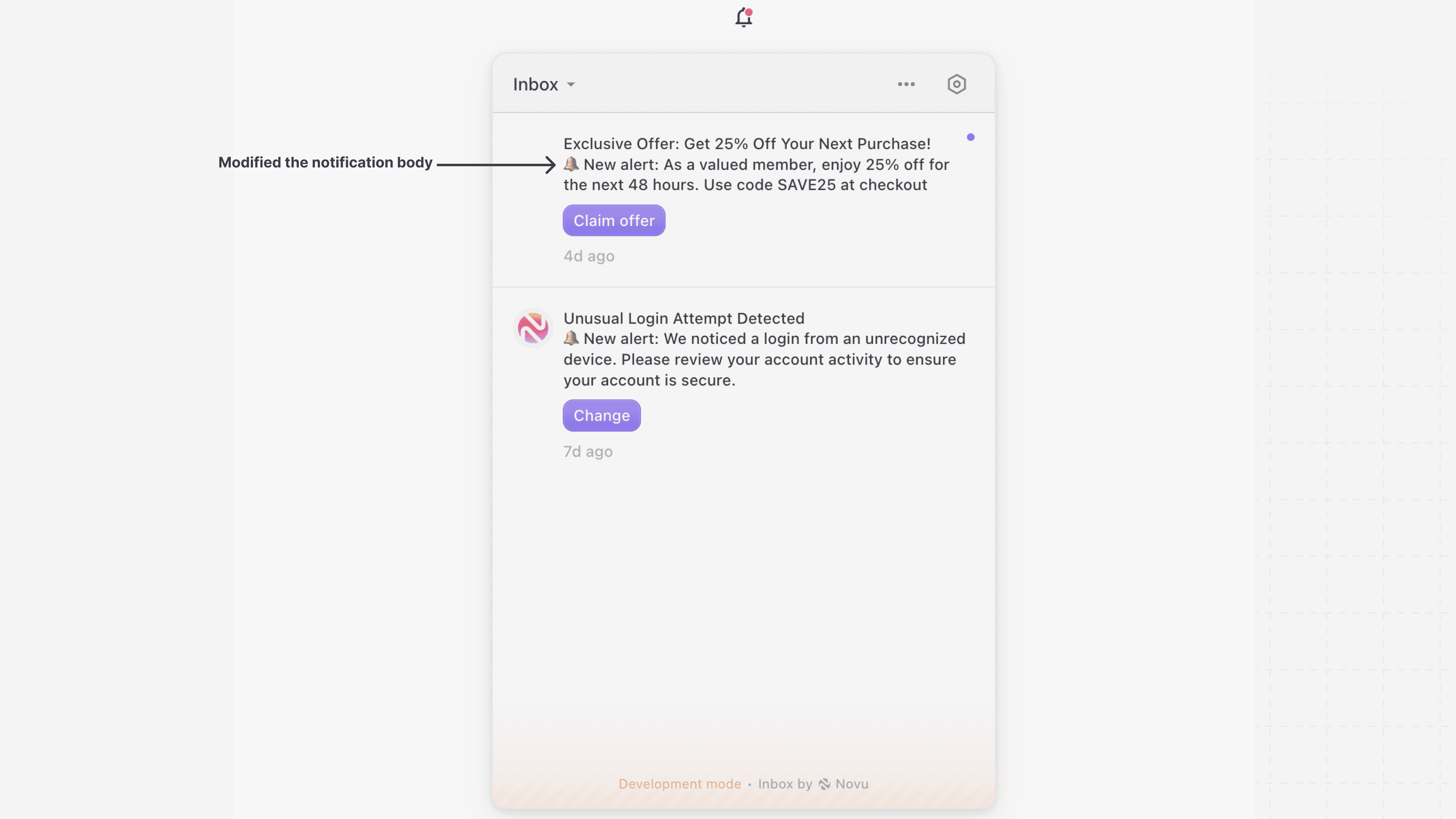
Use `renderBody` if you want to keep the default Inbox UI and only change how the body is rendered. This is useful when you want to customize content formatting or include additional fields from the data object.

<img src="https://mintcdn.com/novu-c5de82d9-inbox-rendering-redesign/rnTO6wzeSEBhSh6h/images/inbox/custom-notification-body.png?fit=max&auto=format&n=rnTO6wzeSEBhSh6h&q=85&s=c64876f66d6e71b0478e60d933e0b4e2" alt="Customize notification body" width="4800" height="2700" data-path="images/inbox/custom-notification-body.png" />

```tsx theme={null}
import { Inbox } from '@novu/react';
 
function NovuInbox() {
  return (
    <Inbox
      applicationIdentifier="YOUR_APPLICATION_IDENTIFIER"
      subscriber="YOUR_SUBSCRIBER_ID"
      renderBody={(notification) => (
        <div>
          <p>🔔 New alert: {notification.body}</p>
        </div>
      )}
    />
  );
}

export default NovuInbox;
```

## Customize notification avatar

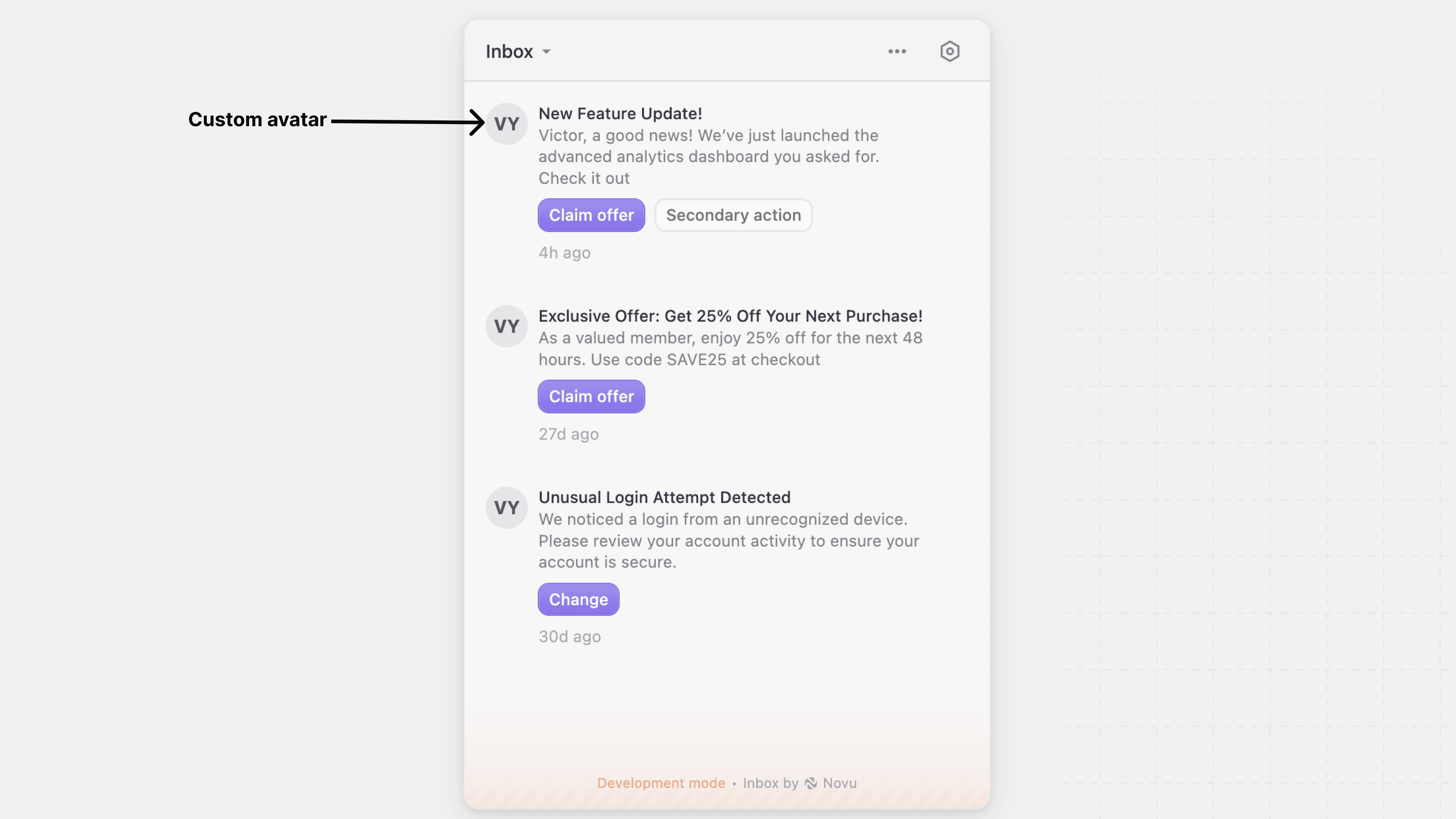
Use the `renderAvatar` prop to replace the default notification avatar with your own custom component. This allows you to display user images, icons, or any other visual element that fits your application's design.

<img src="https://mintcdn.com/novu-c5de82d9-inbox-rendering-redesign/rnTO6wzeSEBhSh6h/images/inbox/customize-notification-avatar.png?fit=max&auto=format&n=rnTO6wzeSEBhSh6h&q=85&s=7c3aa028c153afcbd6ff782aac365509" alt="Customize the notification avatar" width="4800" height="2700" data-path="images/inbox/customize-notification-avatar.png" />

```tsx theme={null}
import { Inbox } from '@novu/react';
 
function NovuInbox() {
  return (
    <Inbox
      applicationIdentifier="YOUR_APPLICATION_IDENTIFIER"
      subscriber="YOUR_SUBSCRIBER_ID"
      renderAvatar={(notification) => (
        <div className="w-8 h-8 rounded-full bg-gray-200 text-gray-700 flex items-center justify-center text-sm font-bold">
          VY
        </div>
      )}
    />
  );
}

export default NovuInbox;
```

## Customize notification actions

Novu provides render props to customize actions:

### Default actions

Use the `renderDefaultActions` prop to override the default action buttons for notifications, such as "Archive," "Mark as Read," and "Snooze."
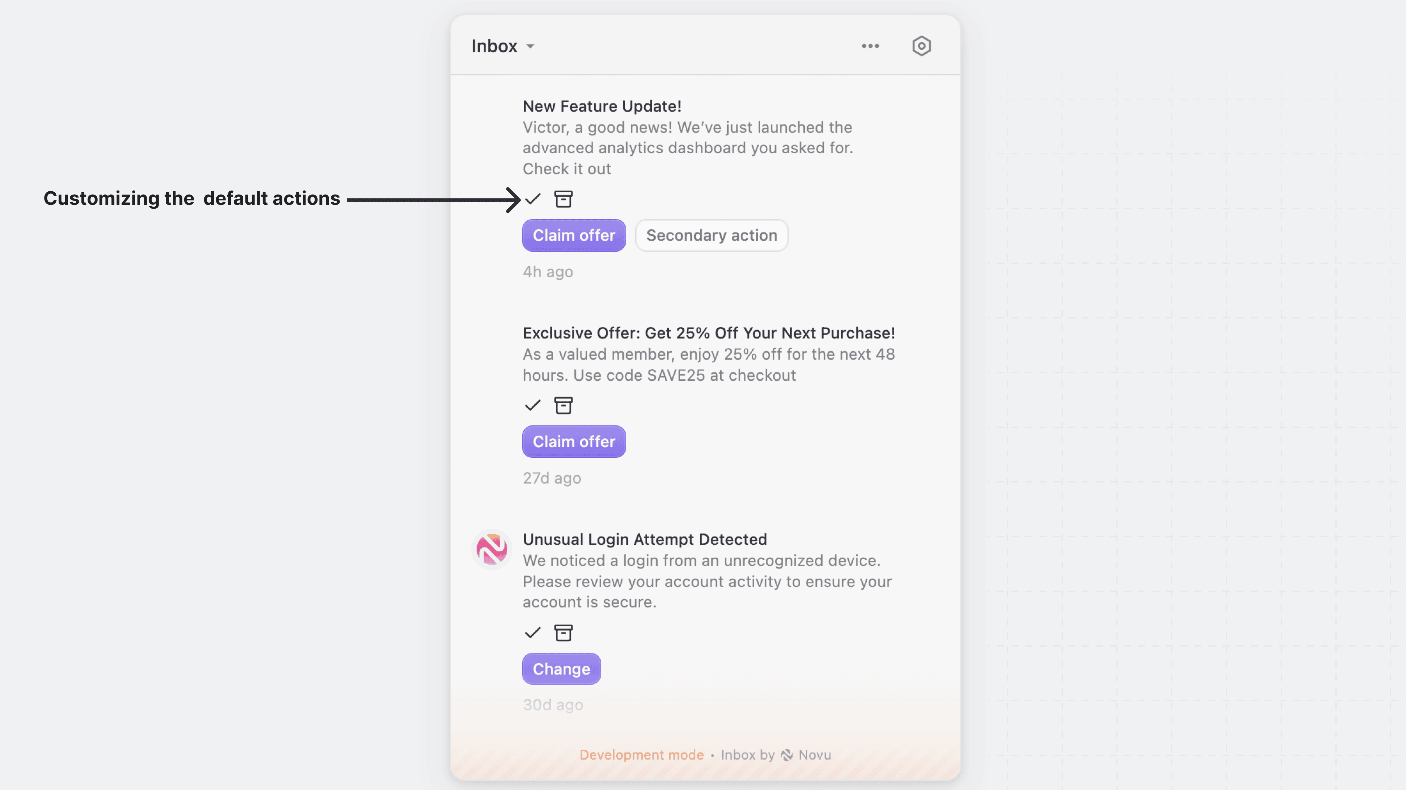
<img src="https://mintcdn.com/novu-c5de82d9-inbox-rendering-redesign/rnTO6wzeSEBhSh6h/images/inbox/customize-default-actions.png?fit=max&auto=format&n=rnTO6wzeSEBhSh6h&q=85&s=097ab632598dc1f4885a50038287f472" alt="Customize the default actions" width="4800" height="2700" data-path="images/inbox/customize-default-actions.png" />

```tsx theme={null}
import { Inbox } from '@novu/react';
import { Archive, Check } from 'lucide-react';
 
function NovuInbox() {
  return (
    <Inbox
      applicationIdentifier="YOUR_APPLICATION_IDENTIFIER"
      subscriber="YOUR_SUBSCRIBER_ID"
      renderDefaultActions={(notification) => {
        <div className="flex gap-2">
          <button
            className="p-1 text-green-600 hover:text-green-800"
            title="Mark as read"
          >
            <Check className="w-4 h-4" />
          </button>
          <button
            className="p-1 text-gray-500 hover:text-gray-700"
            title="Archive"
          >
            <Archive className="w-4 h-4" />
          </button>
        </div>
      }}
    />
  );
}

export default NovuInbox;
```

### Custom actions

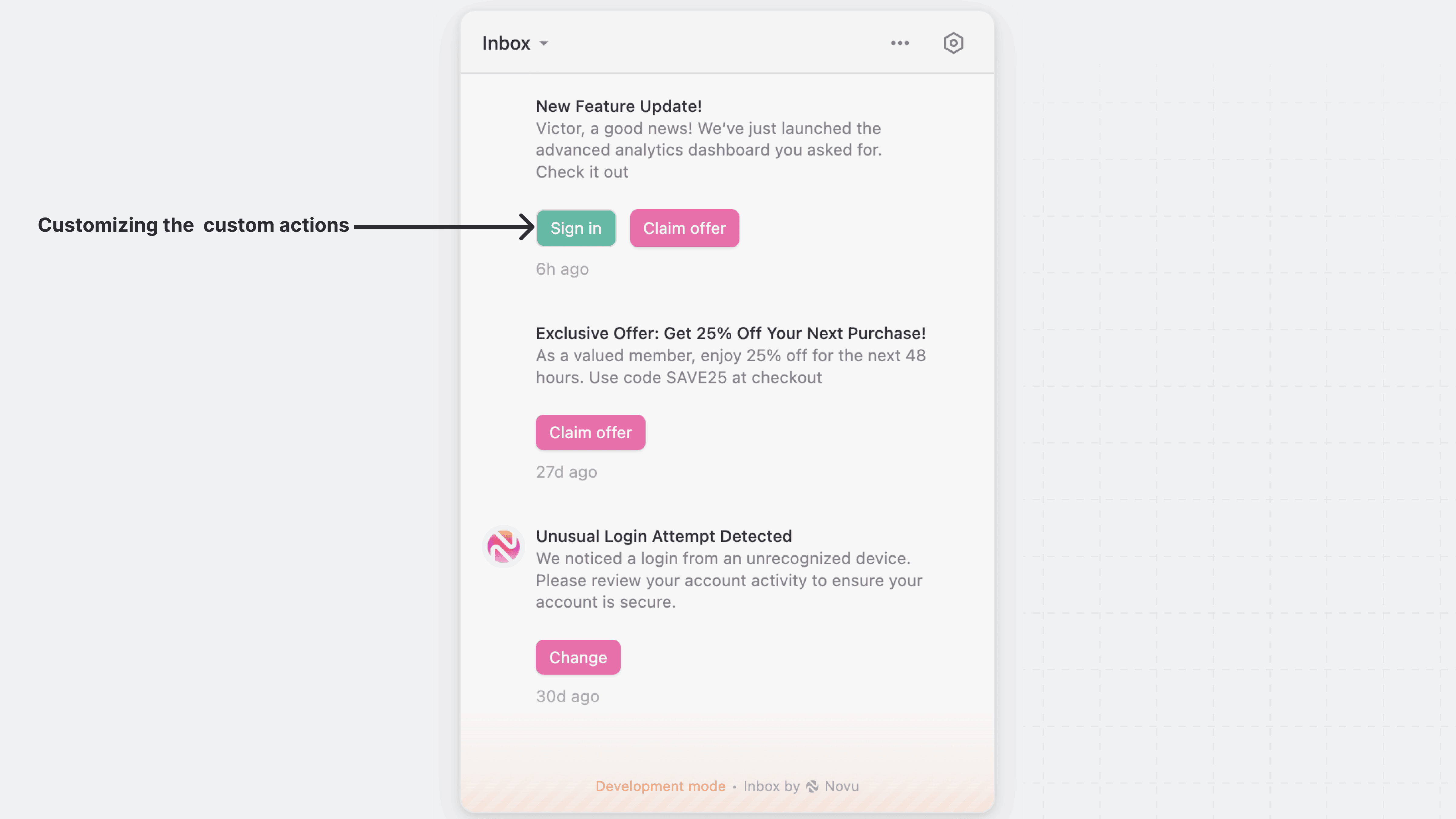
Use the `renderCustomActions` prop to override the primary and secondary actions buttons with your own action button. This is useful for creating unique design and interactions specific to your application.

<img src="https://mintcdn.com/novu-c5de82d9-inbox-rendering-redesign/rnTO6wzeSEBhSh6h/images/inbox/customize-custom-actions.png?fit=max&auto=format&n=rnTO6wzeSEBhSh6h&q=85&s=676c21a16a18afea8c843551cbdf3e66" alt="Customize the custom actions" width="4800" height="2700" data-path="images/inbox/customize-custom-actions.png" />

```tsx theme={null}
import { Inbox } from '@novu/react';
 
function NovuInbox() {

  const primaryButtonStyle = {
    border: 'none',
    padding: '5px 10px',
    borderRadius: '6px',
    cursor: 'pointer',
    fontSize: '12px',
    background: '#FB4CA3',
    color: 'white',
    boxShadow: '0 1px 2px rgba(0,0,0,0.1)',
  };

  const secondaryButtonStyle = {
    border: '1px solid #E0E0E0',
    padding: '5px 10px',
    borderRadius: '6px',
    cursor: 'pointer',
    fontSize: '12px',
    background: '#00B698',
    color: '#ffffff',
  };

  return (
    <Inbox
      applicationIdentifier="YOUR_APPLICATION_IDENTIFIER"
      subscriber="YOUR_SUBSCRIBER_ID"
      renderCustomActions={(notification) => {
        return (
          <div style={{ display: 'flex', gap: '10px', marginTop: '12px' }}>
            {notification.secondaryAction && (
              <button
                style={secondaryButtonStyle}
              >
                Sign in
              </button>
            )}
            {notification.primaryAction && (
              <button 
                style={primaryButtonStyle}
              >
                {notification.primaryAction.label}
              </button>
            )}
          </div>
        );
      }}
    />
  );
}

export default NovuInbox;
```

## Customize the entire notification item

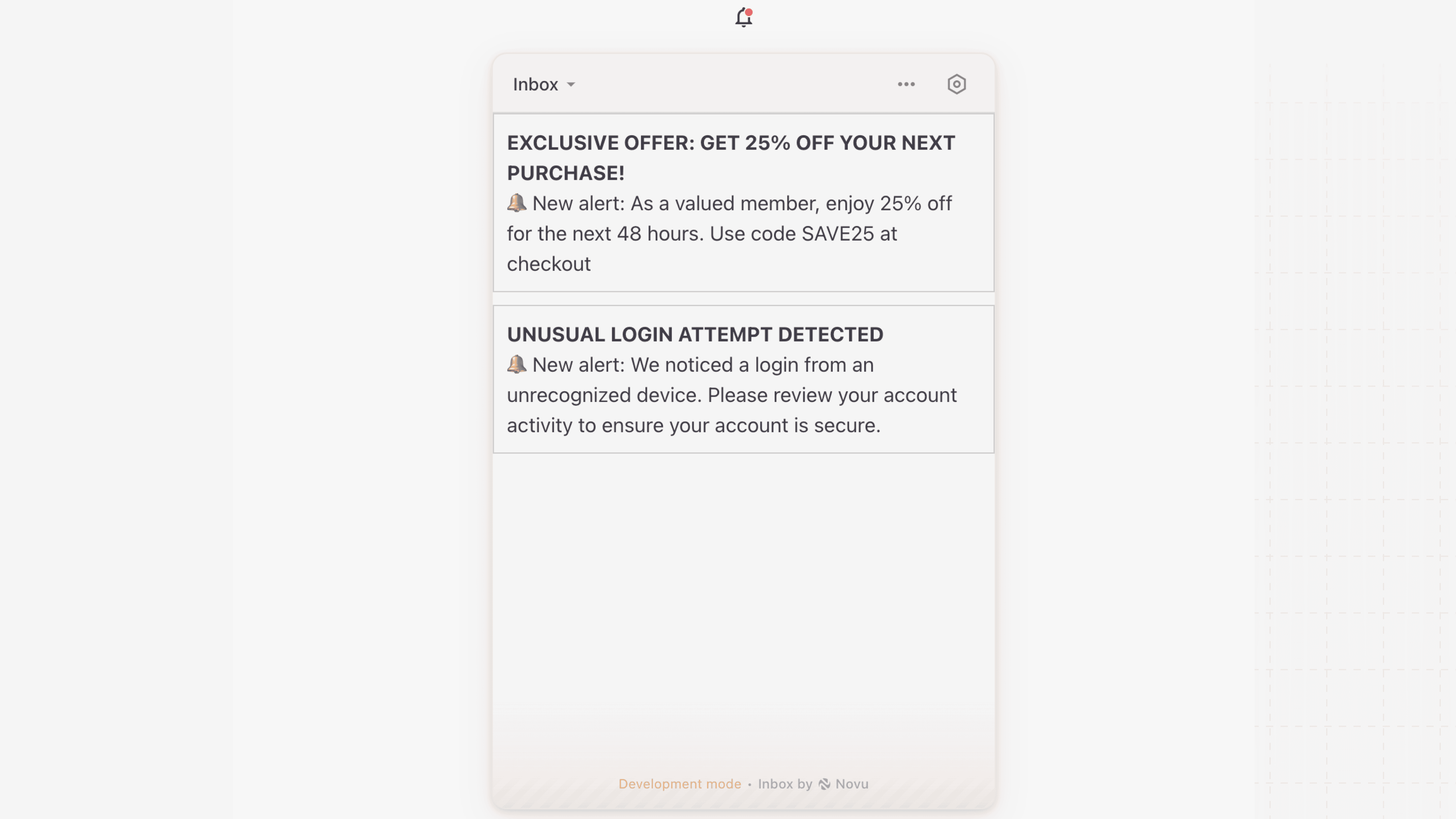
Use the `renderNotification` prop to customize the entire notification item in the Inbox UI, including the container, layout, and the content of the subject and body of each notification.
<Note>
  `renderNotification` gives you full control over the notification UI. You do not have to rebuild the built-in behaviour from scratch: render `NotificationItem` inside it to keep the default look, actions and click handling, and swap or rearrange only the parts you need. See [Reuse the built-in notification item](#reuse-the-built-in-notification-item).
</Note>

<img src="https://mintcdn.com/novu-c5de82d9-inbox-rendering-redesign/rnTO6wzeSEBhSh6h/images/inbox/custom-notification.png?fit=max&auto=format&n=rnTO6wzeSEBhSh6h&q=85&s=caec00b3b47a1c6af355cd054a8e915d" alt="Customize entire notification item" width="4800" height="2700" data-path="images/inbox/custom-notification.png" />

```tsx theme={null}
import { Inbox } from '@novu/react';
 
function NovuInbox() {
  return (
    <Inbox
      applicationIdentifier="YOUR_APPLICATION_IDENTIFIER"
      subscriber="YOUR_SUBSCRIBER_ID"
      renderNotification={(notification) => (
        <div style={{ padding: '10px', border: '1px solid #ccc', marginBottom: '10px' }}>
          <h3>{notification.subject}</h3>
          <p>{notification.body}</p>
        </div>
      )}
    />
  );
}

export default NovuInbox;
```

Render props are render functions. They run again whenever the notification changes, for example after `notification.read()` or a websocket update, and whenever your component re-renders. React reconciles what they return, so a component you render inside a render prop keeps its state across those updates.

## Reuse the built-in notification item

`NotificationItem` is the built-in notification item as a React component. Rendered without children it is the default look, actions included. Rendered with children it becomes a root that carries the item's behaviour, severity styling, hover state, the click that marks the notification read and follows its redirect, around whatever arrangement of its parts you pass.

The parts are `NotificationItem.Avatar`, `Content`, `Text`, `Subject`, `Body`, `DefaultActions`, `CustomActions`, `Date` and `Dot`. Every part accepts a `className`; `Subject`, `Body` and `Date` also accept `children` to replace their content. `DefaultActions` and `CustomActions` keep the built-in read, archive, snooze and action buttons.

### Keep the default look

```tsx theme={null}
import { Inbox, NotificationItem } from '@novu/react';

function NovuInbox() {
  return (
    <Inbox
      applicationIdentifier="YOUR_APPLICATION_IDENTIFIER"
      subscriber="YOUR_SUBSCRIBER_ID"
      renderNotification={(notification) => <NotificationItem notification={notification} />}
    />
  );
}
```

### Swap one part

The same `renderAvatar`, `renderSubject`, `renderBody`, `renderDefaultActions` and `renderCustomActions` props that `Inbox` accepts work on `NotificationItem`.

```tsx theme={null}
import { Inbox, NotificationItem } from '@novu/react';

function NovuInbox() {
  return (
    <Inbox
      applicationIdentifier="YOUR_APPLICATION_IDENTIFIER"
      subscriber="YOUR_SUBSCRIBER_ID"
      renderNotification={(notification) => (
        <NotificationItem
          notification={notification}
          renderBody={(n) => <p>🔔 {n.body}</p>}
        />
      )}
    />
  );
}
```

### Rearrange the parts

```tsx theme={null}
import { Inbox, NotificationItem } from '@novu/react';

function NovuInbox() {
  return (
    <Inbox
      applicationIdentifier="YOUR_APPLICATION_IDENTIFIER"
      subscriber="YOUR_SUBSCRIBER_ID"
      renderNotification={(notification) => (
        <NotificationItem notification={notification}>
          <NotificationItem.Content>
            <NotificationItem.Date />
            <NotificationItem.Text>
              <NotificationItem.Subject />
              <NotificationItem.Body />
            </NotificationItem.Text>
            <NotificationItem.CustomActions />
          </NotificationItem.Content>
          <NotificationItem.DefaultActions />
          <NotificationItem.Avatar />
          <NotificationItem.Dot />
        </NotificationItem>
      )}
    />
  );
}
```

`NotificationItem` uses the same appearance keys as the default item, so `appearance.elements` styles both the same way, and it inherits the `onNotificationClick`, `onPrimaryActionClick` and `onSecondaryActionClick` handlers you pass to `Inbox` unless you give it its own.